
After observing the analytics for this site over the past month after the relaunch, I decided to do a redesign. I mentioned in the site relaunch post that I used an off the shelf design just so I can have something up. It looked ok but I was kind of annoyed with a few features. One of them being the readability on mobile and how big the heading area was. After using it more, it seems as if it was made for tablet design.
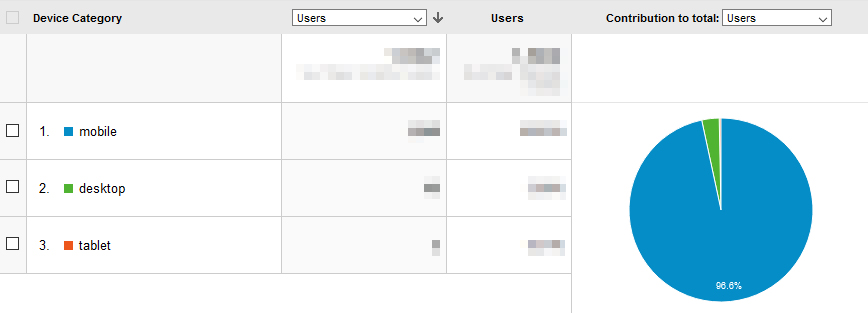
About 96% of visitors are on mobile and only 4% were desktop which was probably me since that is where I make my posts. In last was tablets, which was less that 1% and again was probably also me since I cross check on devices. It also made sense that most of my visitors were on a mobile device since I would do the whole “Link in Bio” thing from Instagram as that is also where a majority of my visitors were coming from. It just make sense to keep the format more towards mobile even though this site’s theme is responsive. I was also debating between light and dark themes so I just did a mix of both to keep everyone happy.
Another reason to do a redesign was that I wanted to write more blogs and behind the scenes stuff. I tend to write long captions on Instagram as another way I like to express the image. I am not a particularly good writer but I do want to share some of my process that is hard to explain on an Instagram post. I do have a longer term goal with the blog and behind the scenes posts which I will expand on later. I know that is not what people come here for but if my writing and content reaches at least a few people, I think I would reach a small goal to a greater goal…or something like that.
Yep that’s it for now and yea, that cover photo had nothing really to do with this post! 😅


Leave a Comment